Use Case 02
Less Content, Better Decisions
Balancing editorial visibility with user clarity in a multi-platform OTT experience.
The challenge
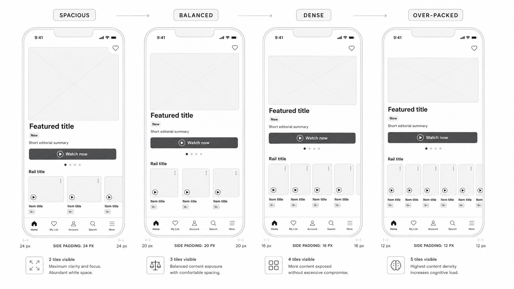
In OTT streaming products, a common business instinct is to increase content exposure: show more tiles, reduce margins, tighten layouts, and fit more options onto the screen. The assumption is simple: the more content users can see, the more likely they are to find something to watch.
Research showed a different pattern. Increasing visible density could also increase perceived complexity, reduce decision confidence, and make it harder for users to choose. The opportunity was not to simply show less content. It was to design a better decision-making experience.
Promote more content, increase catalogue visibility, support editorial campaigns, and create more paths to playback.
Understand what is relevant, scan quickly, compare options easily, avoid overwhelm, and feel confident choosing.
Reduce visible density, improve hierarchy, strengthen editorial labels, group by intent, and improve content signals.
Research-led approach
- Usability testing to observe scanning behavior, hesitation, and ease of choosing what to watch.
- User interviews to capture perceptions of effort, overwhelm, relevance, and decision confidence.
- A design audit across density, hierarchy, metadata, grouping, repetition, scanability, and platform consistency.
- A/B concept comparison between a denser content approach and a more structured discovery model.
Key insight
Users were not asking for more content. They needed clearer reasons to choose. The design direction shifted from “How do we fit more content on screen?” to “How do we help users make faster, clearer, and more confident viewing decisions?”
Content Decision Quality Framework
Is this content meaningful to the user in this moment?
Can the user quickly understand what it is and why it appears here?
Are the options meaningfully different, or do they feel repetitive?
Does the presentation help the user feel ready to choose?
Is the next step clear?
Does this section reduce decision effort or add more noise?
The work helped the team move from a “more tiles” mindset to a more intentional discovery model. Research evidence supported a compromise between editorial visibility and user clarity, reducing perceived complexity by 35 percentage points while preserving 92% of editorial visibility through better prioritization.
Impact at a glance
Directional outcomes from research synthesis, usability testing, and concept comparison.
Improvement in perceived clarity.
Improvement in decision confidence.
Improvement in ease of scanning.
Reduction in perceived overwhelm.
Reduction in drop-off risk before playback.
Editorial visibility retained through prioritization.
This project reflects how I approach product design as a lead: by connecting user evidence, business goals, UX principles, and practical delivery constraints. The value of design was not in showing less content. It was in helping users choose better, faster, and with more confidence.